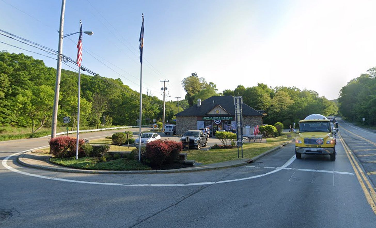
A truck. An American flag. A gas station and convenience store named Appalachian Market — so-called because it literally sits along the Appalachian Trail.
Any guesses as to where we are? Somewhere in rural Tennessee or West Virginia?
No, folks. We’re in the big city! According to the Census Bureau, this is New York! Not the city proper, granted — but part of the same continuous “New York–Newark–Jersey City, NY-NJ” metropolitan area.
To be fair, I’m slightly tricking you with those rural tropes. Some of the northern reaches of the New York metro really can have rural vibes, along with patches of Trumpiness. But Appalachian Market is located in Garrison, New York, a well-to-do, largely blue hamlet in Putnam County that doesn’t really fit the stereotypes invoked by the photograph. Still, Garrison is a small town — and sitting roughly at the boundary (IMO) between Upstate and Downstate New York, it’s too far for a regular commute1, making its connection with the city tenuous.
But my purpose here isn't to critique the Census Bureau's definition of metro areas2 so much as to point out that “urbanness” is a complicated concept and one that isn't well-articulated by a binary switch between urban and rural. Even within areas that are unambiguously urban, there are many gradations. I love Kansas City, where my partner’s family is from, but Manhattan it ain't. And Manhattan, Kansas definitely isn’t Manhattan, New York, though it's also considered urban by the Census Bureau.
This is a politically relevant distinction, too, because urbanness is a strong predictor of voting behavior. Increasingly, the more urban it is, the more you can expect a place to vote Democratic, even after controlling for other variables like its racial composition or education levels.
For instance, in the presidential forecast — which I’m working on getting ready for paying subscribers — urbanness is one of the key demographic and geographic variables that I use to infer the correlations between voting in different states. So I need a good measure of it. And I don’t particularly like the Census Bureau’s version that puts Manhattan, Kansas and Manhattan, New York into the same bucket.
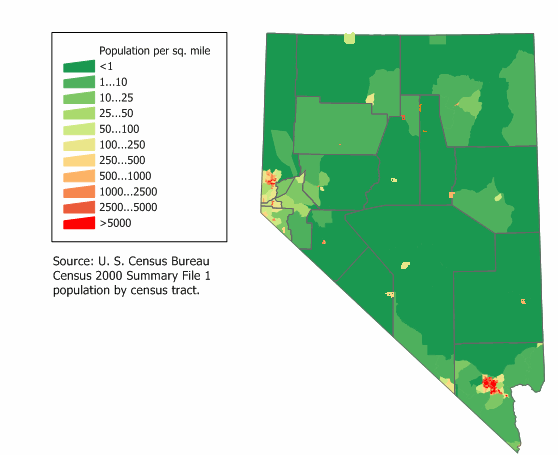
Population density is one alternative, but it also has problems. For instance, let’s talk about the state where I’m writing this from, Nevada.
Nevada has only the 42nd highest population density among the 50 states. But more than 80 percent of Nevada’s land is owned by the federal government or is otherwise incredibly inhospitable (albeit very pretty). Las Vegas is somewhat literally an oasis in the desert — but it’s where a large majority of Nevadans live. And Las Vegas really is quite dense, so the typical Nevadan’s experience is an urban experience.
Here, then, is the solution I came up with a few years ago. I call it the Urbanization Index, and it is defined as follows:
Using Census tract data — currently, I’m using the 2020 decennial Census — I estimate how many people live within a 5-mile radius of every Census tract.
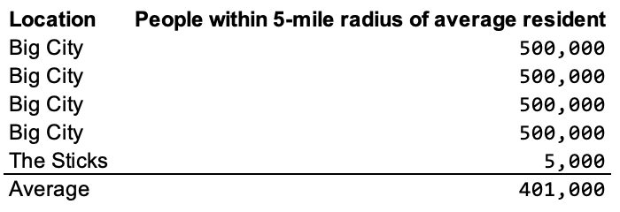
Then I take the average of this figure for all people in the state. For instance, if 80 percent of people in a state live in a Big City surrounded by an average of 500,000 people, and 20 percent live in rural areas with 5,000 people within their 5-mile radius, the average would be somewhere around 400,000:
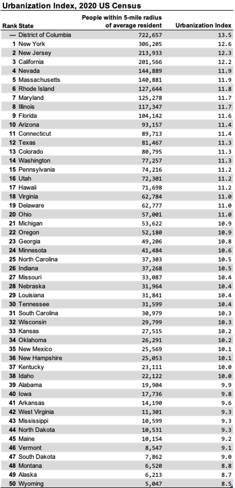
Finally, I take the natural logarithm of this number. Voilà! This is the Urbanization Index (UI):
Perhaps nothing too surprising here. But note that Nevada — just 42nd in population density — moves up all the way to 4th in the UI. And New York ranks first. No, Garrison isn’t New York City — but there are a lot more people in the city than in Garrison, and the extremely high population densities of the five boroughs and the near-in suburbs are more than enough to make up for it.
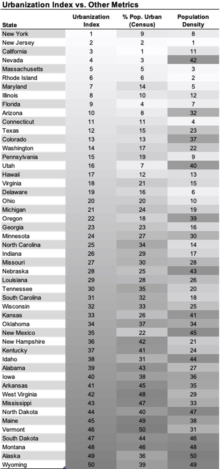
Finally, here is a comparison of the UI to two other metrics: population density and percentage of a state’s population considered to be urban by the Census’s binary urban/rural distinction.
The UI serves as a relatively good compromise between population density and the urban population percentage. I endorse its view that New York is more urban than New Jersey, which is really more medium-high density throughout the state (outside of Newark and immediate Philly burbs like Camden). A few other notes:
New England is unusual in the US for having a lot of small towns and villages that are in relatively close proximity to one another without a lot of uninhabited space. Population density probably overrates how urban these states are, but the binary urban/rural distinction might underrate it; towns are often located within a few miles of one another.
The Interior West, conversely, has lots of empty space — but as in the case of Nevada, much of the population lives in urban areas. However, outside of Las Vegas, Phoenix and Denver, most of these urban areas aren’t that dense. So the UI may be a good compromise for states like Utah and New Mexico.
Texas ranks higher according to the UI than in either of the other metrics, while Florida ranks lower. The speed of development in Texas really is something — I remember taking a drive from Dallas to Austin maybe 10 years ago and the number of cranes and new sub-developments almost looked like something out of China’s Belt-and-Road Initiative. Texas is also a good bet to continue moving up the list — I’d expect it to move within the top 10 in the UI by the 2030 Census.
If you like this sort of geeky, data-driven post, by the way, you’ll probably get more of them over the next several weeks as I scramble to prep the model while also playing the WSOP and getting various other projects underway. That’s my way of saying that I’ll be a little pressed for time and writing up some of the underlying data from the model is a good way to take advantage of work that I’m already doing anyway. I’ll have updated pollster ratings coming soon too, for instance.
As a reminder, though, while the polling averages generated by the model will be free, the probabilities and the more detailed forecast will be behind the paywall this year. (For various reasons: partly because the advertising-based model is broken, but just as much because I’d rather have narrower audience that “gets” what the probabilities mean than a larger one who doesn’t.) If you’re interested, you can sign up using the link below.
There’s a friendly dispute with this claim in the comments; Garrison is about 1:15 minutes from Grand Central Station on Metro-North. But keep in mind that you’re tacking on some time at the beginning and the end depending on how close your home is to the train station and how close your office is to GCT, so 1:30 to 1:45 may be more realistic. Listen, I love the Metro-North and the Hudson Valley, and if you want to spend 3 hours commuting per day round trip, I think that could be a rational choice under some circumstances. But it’s a fairly small percentage of the workforce — about 3 percent of commuters — who have this particular selection of preferences, though it would likely be more if more people had the option to make the commute via train rather than driving.
OK, it’s pretty weird to consider San Francisco and Silicon Valley to be separate metro areas, but we’ll take that up at another time.


Nate, small nit, but Garrison is an excellent commuter town with the train station that goes right into the city. West Point is right across the river, and the Garrison stop is the preferred mode for cadets on pass traveling to the city.
The Wisconsin-Minnesota difference is an interesting one, with Milwaukee’s demise versus the Twin Cities’ growth an interesting divergence correlating/causing very different political and economic fates.